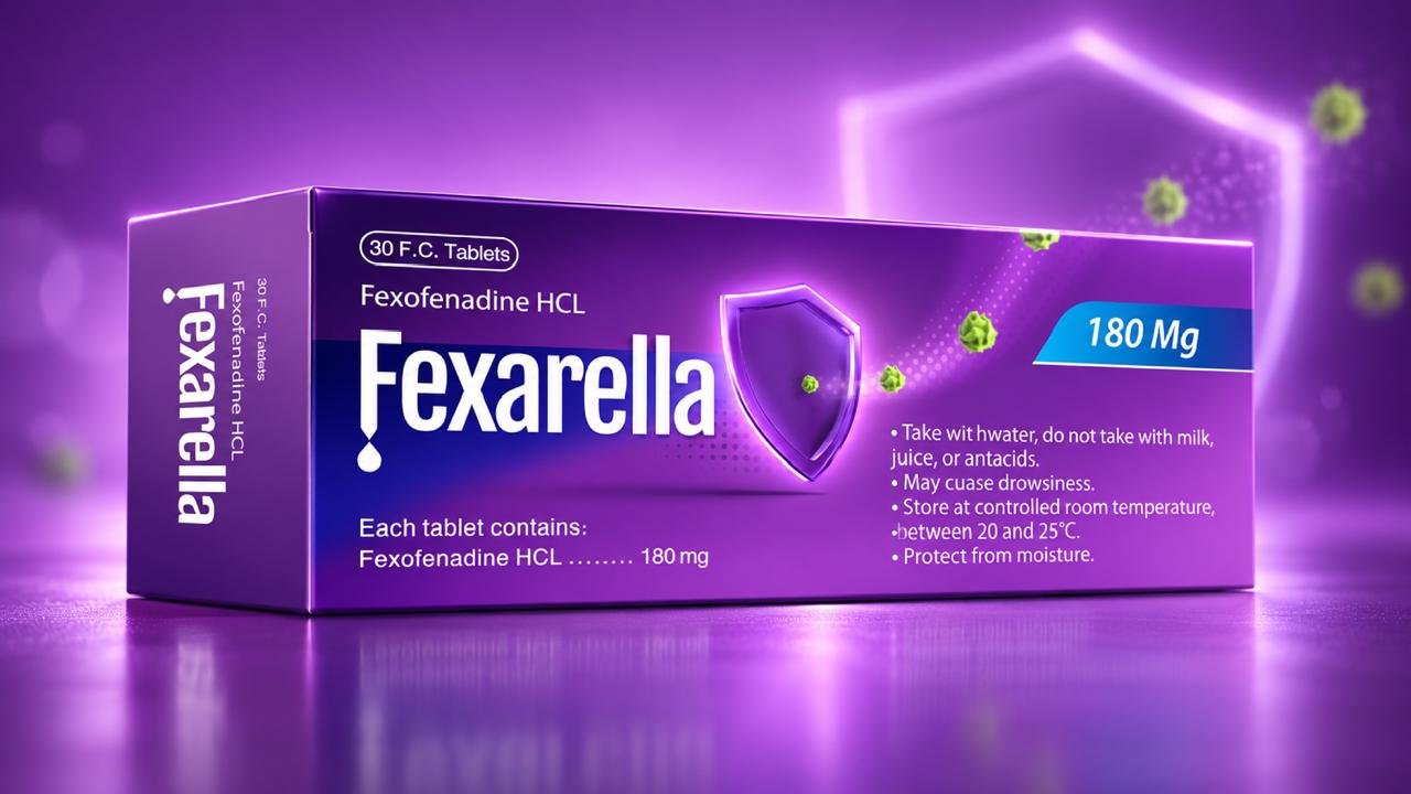
The pharmaceutical aisle is historically plagued by clinical monotony: sea after sea of sterile white boxes, utilitarian typography, and indistinguishable layout formulas. In regulated categories like antihistamines (Fexofenadine HCL), brands frequently fade into commodity status, lost behind pharmacy counters and visual noise.
Our challenge was strategic and multifaceted: conduct an in-depth audit of the pharmaceutical landscape, understand regulatory boundaries, and determine whether to subvert or elevate category codes. The objective was clear: shatter the ‘sterile white box’ syndrome without sacrificing clinical rigor, dosage clarity, or medical authority.
For Fexarella, our team developed a bold design architecture that transforms clinical treatment into empowering relief:
- Chromatic Disruption: Departing from conservative clinical whites and pale blues, we introduced an electrifying royal violet palette. On pharmacy shelves and display racks, this rich contrast commands instant visual dominance, capturing attention in milliseconds.
- Iconic Visual Metaphor (The Shield): To visually communicate the drug’s anti-allergy mechanism, we designed a glowing 3D protective shield deflecting allergen particles. This communicates efficacy and immediate physical defense at an instinctive, non-technical level.
- Clarity in Information Hierarchy: Crucial dosage metrics (180 Mg) and safety directions are framed in high-contrast cyan badges and crisp typographic systems, providing absolute confidence and clarity for both pharmacists and patients.
While Fexarella illustrates our specialized proficiency in navigating strict pharmaceutical regulations, this methodology reflects Boldern’s universal packaging philosophy. Whether developing FMCG retail goods, premium beverages, personal care products, or digital packaging experiences, our team analyzes market dynamics to build distinctive brand assets that dominate retail merchandising and make an enduring impression inside the consumer’s home.