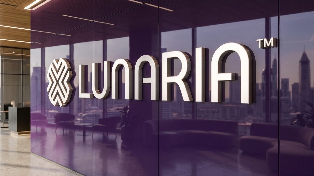
To formulate a cohesive personality, Boldern mapped Lunaria’s brand DNA through a deliberate tripartite archetype matrix:
- The Creator (60%): Personified by visionary founders like Steve Jobs, embodying relentless innovation, imagination, and the determination to bring bold futures into present reality.
- The Sage (30%): Personified by deep strategic intellect like Bill Gates, delivering analytical rigor, data-driven market comprehension, and institutional wisdom.
- The Explorer (10%): Personified by pioneering frontier discoverers like Yuri Gagarin, driving the ambition to venture into uncharted technological frontiers and discover next-generation market opportunities.
This tri-archetype blend established Lunaria’s positioning: an authoritative, confident, and visionary guide that turns visionary potential into tangible equity under the definitive tagline: ‘Future Crafted Today’.
The nomenclature draws from Lunaria annua (the botanical ‘Money Plant’), renowned for its translucent, coin-like seed pods representing enduring wealth and resilience. The name also bridges cross-cultural significance: evoking lunar symbolism revered in Middle Eastern heritage while carrying noble resonance through ‘Aria’.
Boldern engineered a geometric emblem founded on mathematical precision and multi-layered symbolic synergy:
- The Quad-L Convergence (Unity): Four interlocking letterforms of ‘L’ join seamlessly at right angles, symbolizing four pillars of strength converging into a cohesive ecosystem.
The Shield of Capital Security: A fortified silhouette that guarantees protection against volatile risks, reassuring stakeholders of safeguarded equity. - The Dynamic Market Vector: Concentric directional arrows radiating upwards, visually capturing market momentum, accelerated startup scaling, and compounding capital appreciation.
- Solar Illumination & Coin Geometry: A central cruciform aperture reflecting solar enlightenment and the circular geometry of timeless currency.